IBCS-like area charts in Pyramid compare two measures and show only upward and downward differences between their values. You can change the color corresponding to each in the Formatting panel. Values are displayed on the chart, with the final difference on the right-hand side. Additionally, you can hover over sections of the chart to display specific values at that point, and the value of the difference.
Using IBCS logic
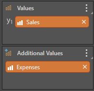
Because IBCS-like charts compare the difference between values of two measures, you must add a second measure to the Values panel. Once you have two measures in Values, click on the button corresponding to the IBCS chart type you want. The second measure is moved to a separate panel, called Additional Values:
Waterfall Example
See the Waterfall Chart page for more information on creating a Waterfall chart:

In the above chart, we see the dotted line at the top (purple arrow) representing the starting budget, with the arrow at the end showing the difference between that and the final value (orange arrow). The red and green values between these two points depict the differences between budget and expense for a number of departments. Hover over any point of the chart to get the precise values at that point, and the difference between them.
Note: To display the difference between the measures correctly, you must use the "IBCS" theme. This is available from the Themes on the Design tab.
Formatting
The Formatting panel for IBCS-like charts includes an IBCS tab to assist in chart formatting (green arrow below):
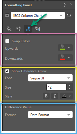
Note: The preceding image shows the Formatting panel for an IBCS Column Chart, but the same fields are available for all IBCS-like charts.
Swap Colors
Change the colors used to display Upwards and Downwards differences (purple highlight above).
Show Difference Arrow
Choose whether to display a Difference Arrow and select the formatting for it (yellow highlight).
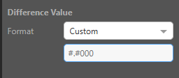
Difference Value
Change the format of the Difference Value when it is used in the visual tooltip (blue highlight). The options are as follows:
Data Format
Default. Use the same formatting for the Difference Value as is applied to the primary measure.
Custom
Specify a custom format for the Difference Value. When Custom is selected, a text field opens that you can type a custom format code into. Custom format codes are the standard patterns that control how a number is displayed using placeholders and separators: